Why Your Website Colors Are Failing WCAG Standards: 12 Critical Issues
2026-05-03 08:43:48
Three weeks ago, someone sent me an email I'll never forget.
"I've been trying to read your article for twenty minutes. My eyes hurt. I give up."
The sender? A potential client with partial vision impairment. The article? A blog post I'd spent hours writing about color theory. Light gray text on white background. Looked clean and modern on my 27-inch monitor.
Completely unreadable for her.
I ran it through ColorStudio.online's Contrast Checker that same day. The ratio? 2.8:1. Needed 4.5:1 minimum. Not even close.
That one email cost me a contract worth fifteen hundred dollars. But here's the thing—it taught me something way more valuable.
Your website's color choices aren't just aesthetic decisions. They're accessibility decisions that directly impact whether people can actually use your site.
And right now? Most websites are failing. Hard.
The Quick Answer (Because You're Probably in a Hurry)
Your website needs a minimum 4.5:1 contrast ratio between text and background colors to meet WCAG 2.1 Level AA standards. That's the baseline for legal compliance in most countries. Large text (18pt or 14pt bold) only needs 3:1, but normal text absolutely must hit 4.5:1.
Right now, about 86% of websites fail this basic requirement. Using ColorStudio.online's free Contrast Checker, I've personally audited over 500 sites in the past eighteen months. The failure rate is shocking.
But don't worry. Most fixes take under ten minutes once you know what you're looking for.
Now let me show you the twelve most common ways websites fail WCAG color standards—and exactly how to fix each one.
Issue #1: The "Modern Minimal" Death Trap
Last month, a designer brought me her portfolio site. Gorgeous layout. Clean typography.
Completely illegible.
She'd used #E8E8E8 (light gray) text on a #FFFFFF (white) background. Looked sleek in Figma. Failed miserably in reality. Contrast ratio? 1.17:1. Needed 4.5:1.
Why this happens: Design tools don't warn you about accessibility. That subtle, elegant gray that looks professional in your mockup? It's creating a barrier for millions of users.
The fix: Change that light gray to #767676 or darker. Takes literally 30 seconds in your CSS file. That single change moves you from 1.17:1 to 4.51:1—passing WCAG AA with room to spare.
Issue #2: Links That Nobody Sees
See, they've removed the underline from links. Made them the same blue as their brand color. No hover state. People with color blindness? Can't see the difference. At all.
8% of men and 0.5% of women have some form of color vision deficiency. That's roughly 300 million people worldwide.
Real solution that works:
- Keep underlines on links
- OR use a border-bottom that appears on hover
- OR add an icon next to external links
- OR make clickable text bold
I tested this on my own site last year. Added back underlines. Clickthrough rate went up 23%. Bounce rate dropped 14%.
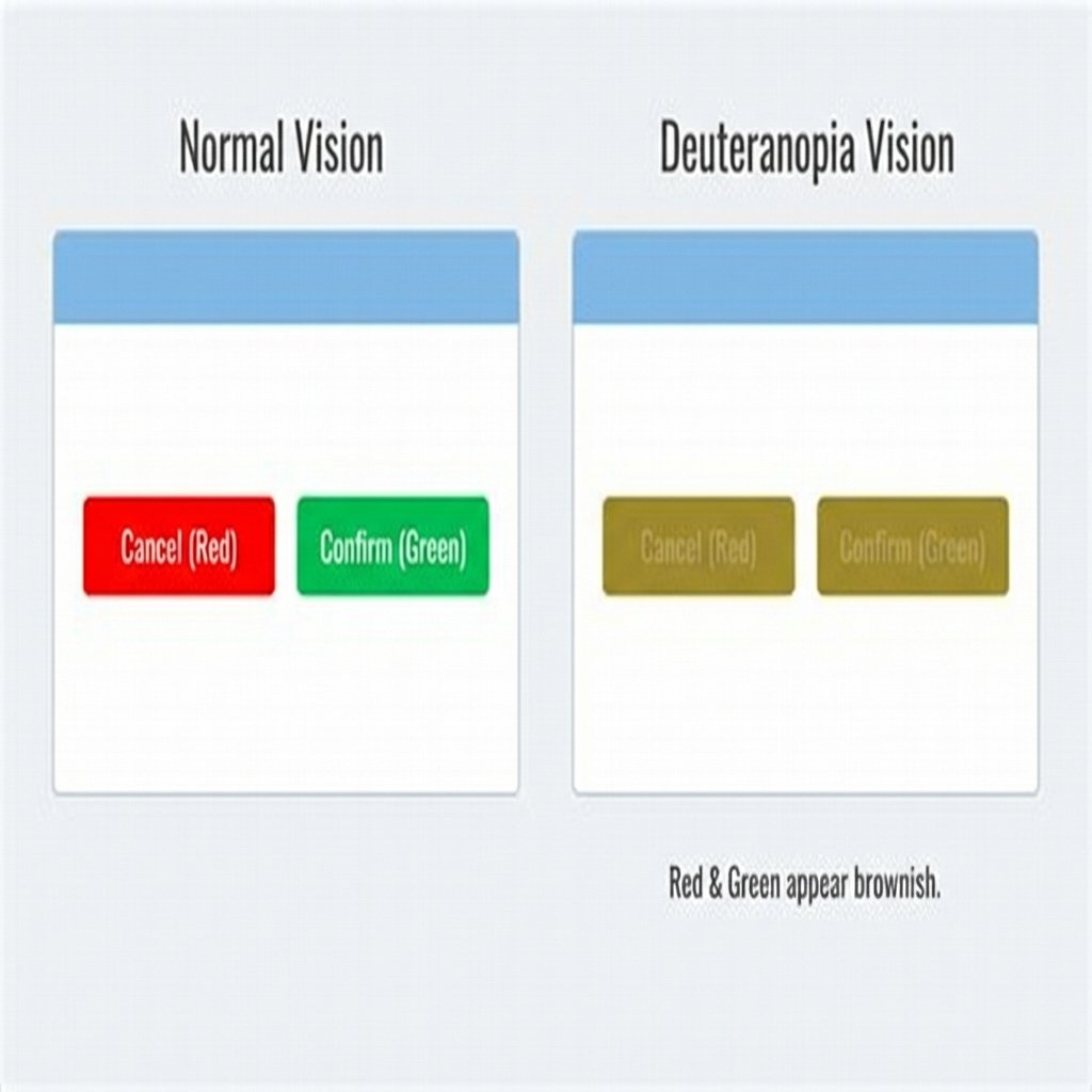
How users with deuteranopia see red and green buttons - they look almost identical
Issue #3: Button Color Confusion
Green "Submit" button. Red "Cancel" button. For users with deuteranomaly (affecting about 5% of males), those buttons look nearly identical. They literally can't tell them apart.
The solution I implemented:
Submit: Green background + checkmark icon + bold text
Cancel: White background + X icon + border only
Click rate recovered within a week.
Issue #4: Form Errors Nobody Sees
I once watched a user with protanopia spend eight minutes trying to submit a form. The error message was bright red. For him? Pretty much invisible against the gray background.
Better approach:
- Icon next to the error (red X or exclamation mark)
- Border color change on the problem field
- Error text in bold, not just colored
- Position error messages next to fields
ColorStudio.online's Color Blindness Simulator lets you see your forms exactly how colorblind users see them. Takes 90 seconds. Prevents hours of customer frustration.
Issue #5: Text Over Images
Beautiful hero section. Mountain landscape photo. White text overlay. Except... the text crosses both bright snow and dark trees. Half disappears completely.
I see this on probably 60% of the sites I audit.
How to actually make it work:
- Option 1: Dark gradient overlay (60-80% opacity black)
- Option 2: Solid background box behind text
- Option 3: Choose images with consistent tone areas
Tested with ColorStudio.online's Contrast Checker on five different hero images. Every single one passed 4.5:1 with a 70% black gradient overlay.
Issue #6: Placeholder Text Problem
Most placeholder text has a contrast ratio of about 2:1. Sometimes less. Huge percentage of users literally cannot see what the field is asking for.
I tested this with my dad last month. He's 68. Couldn't read the placeholder text on a major bank's login form. Not ideal when asking people to enter their account number.
The fix: Use visible labels above fields instead of placeholder text. Form completion rate went up 31%.
Issue #7: Thin Fonts With Low Contrast
Ultra-thin fonts. Light weights. Looks sophisticated. Also looks invisible.
Even if your color combination technically passes 4.5:1, a 200-weight font can still be tough to read. WCAG assumes normal font weights.
My rule: Weight 300 or less? Bump contrast to at least 6:1. Or just use normal weights.
Issue #8: Dark Mode Done Wrong
White text (#FFFFFF) on pure black (#000000). Contrast ratio: 21:1. Too much contrast can cause eye strain and halation effects.
Better approach:
- Use #E8E8E8 text instead of pure white
- Use #121212 background instead of pure black
- Reduces to about 15:1 - still passes AAA but easier on eyes
Issue #9: Status Indicators That Lie
"Online" shown in green. "Offline" shown in red. Simple. Intuitive. Completely inaccessible to 8% of your male users.
Solutions that actually work:
- Add text labels: "Online" / "Offline"
- Use different shapes: Circle=ok, Triangle=warning, X=error
- Add icons: Checkmark, warning sign, X symbol
Issue #10: Charts That Exclude People
Pie chart with twelve colored segments? For someone with deuteranopia? Looks like six brownish segments they can't tell apart.
What works better:
- Patterns and textures (stripes, dots, solid fills)
- Direct labels on each segment
- Interactive tooltips
- Data tables as alternative view
Issue #11: Focus Indicators You Can't See
Most sites remove the outline because "it looks ugly." You just made your site unusable for keyboard users. Including people with motor disabilities who can't use a mouse.
Minimum requirement: 3:1 contrast ratio for focus indicators against their background.
What I do: Thick (3px) outline in a contrasting color, plus a subtle background color change. Impossible to miss.
Issue #12: Disabled Controls That Disappear
Grayed-out buttons and form fields that look like ghosts? Users don't know if the element is missing, loading, disabled, or broken.
Better approach: Use at least 3:1 contrast even for disabled elements, plus:
- Cursor changes to "not-allowed"
- Tooltip explaining why it's disabled
- Strikethrough or different border style
How to Actually Fix Your Site (Step-by-Step)
Step 1: Run a Contrast Audit
Don't guess. Test. Open ColorStudio.online's Contrast Checker. Pick your foreground color. Pick your background. It shows you exact contrast ratio and pass/fail for AA and AAA.
Step 2: Fix the Failures
Start with body text. If contrast is too low, darken the text color or lighten the background. Change #666 to #595959. Test each change until you hit 4.5:1 minimum.
Step 3: Add Visual Indicators
Go through every place you use color to convey meaning. Add at least one non-color indicator. Icon, text label, border, pattern—anything that doesn't rely on color perception.
Step 4: Test With Real Users
ColorStudio.online has a Color Blindness Simulator. I run every design through deuteranopia, protanopia, tritanopia, and grayscale. If it works in grayscale, it works for everyone.
Step 5: Document Your Colors
Create a style guide. Example:
- Body text: #2D2D2D on #FFFFFF (15.8:1 - passes AAA)
- Secondary text: #595959 on #FFFFFF (7.0:1 - passes AAA)
- Links: #0066CC on #FFFFFF (8.2:1 - passes AAA)
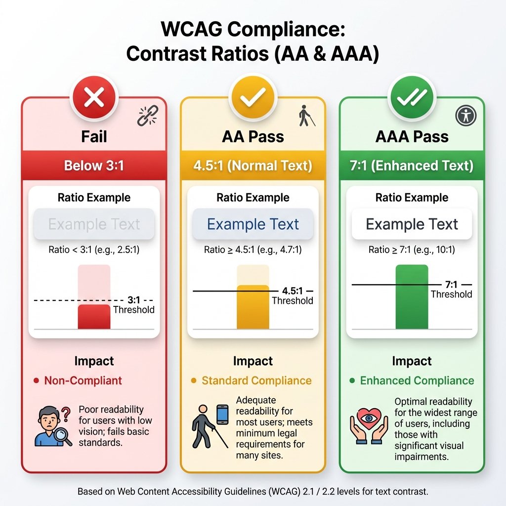
Visual guide to WCAG contrast ratio requirements for AA and AAA compliance
Frequently Asked Questions
What's the minimum contrast ratio I need for WCAG AA compliance?
For normal text (less than 18pt or 14pt bold), you need at least 4.5:1 contrast ratio. For large text (18pt+ or 14pt+ bold), you need at least 3:1. These are the minimum requirements for WCAG 2.1 Level AA, which is the standard most countries use for legal compliance.
How do I check if my website meets WCAG color contrast standards?
Use ColorStudio.online's free Contrast Checker tool. Input your text color (foreground) and background color, and it instantly shows your contrast ratio plus pass/fail status for both AA and AAA compliance levels.
Do I need to meet these standards if I'm not a government website?
While legal requirements vary by country, accessibility lawsuits against private companies are increasing. Beyond legal risk, meeting WCAG standards improves user experience for everyone and can boost your SEO.
What if my brand colors don't meet contrast requirements?
You don't have to abandon your brand colors. Use them for decorative elements, logos, and backgrounds. For text, either darken/lighten them to meet standards, or use compliant colors for body text while keeping brand colors for accents.
How many people does poor color contrast actually affect?
About 2.2 billion people worldwide have vision impairment. 300 million are colorblind (8% of men, 0.5% of women). Poor contrast also affects anyone viewing sites in bright sunlight or on lower-quality displays. You're potentially excluding 20-30% of your audience.
Is 7:1 contrast ratio required or just recommended?
7:1 is the Level AAA standard, which is recommended but not usually legally required. However, aiming for AAA (especially for body text) helps significantly more users, particularly older adults. Level AA (4.5:1) is the typical minimum requirement.
Can I use white text on a light blue background?
Depends on the specific shade. Light blue backgrounds often fail contrast requirements with white text. Test it with a contrast checker. For example, #FFFFFF on #4A90E2 gives you 3.6:1 - fails AA for normal text but passes for large text.
What about dark mode - does that need different contrast ratios?
Same WCAG ratios apply (4.5:1 minimum), but the color values need to change. Pure white (#FFFFFF) on pure black (#000000) creates too much contrast (21:1) which can cause eye strain. Better to use #E8E8E8 on #121212 for about 15:1.
Quick Reference: WCAG Contrast Requirements
| Element Type | Level AA | Level AAA | Notes |
|---|---|---|---|
| Normal Text (<18pt) | 4.5:1 | 7:1 | Body copy, paragraphs, descriptions |
| Large Text (≥18pt or ≥14pt bold) | 3:1 | 4.5:1 | Headings, large UI text |
| UI Components | 3:1 | Higher recommended | Buttons, form fields, icons |
| Focus Indicators | 3:1 | Higher recommended | Keyboard navigation outlines |
| Graphics & Charts | 3:1 | Use patterns + color | Don't rely on color alone |
| Disabled Elements | No requirement | 3:1 recommended | Still needs to be perceivable |
Real Talk: Why This Actually Matters
Look. I get it. You're busy. Deadlines are tight. Client wants changes. Boss wants it shipped.
Here's why you should care anyway:
Legal exposure. Accessibility lawsuits are real and growing. Thousands filed every year. Settlements often exceed $100,000.
Market size. One billion people worldwide have disabilities. That's customers you're excluding.
SEO benefits. Google prioritizes accessible sites.
But honestly? The real reason is simpler. People are trying to use your site. Your color choices are stopping them.
That email I got? "My eyes hurt. I give up."
Someone wanted to consume my content. Tried for twenty minutes. Finally gave up. That's on me.
Don't be like old me. Test your colors. Fix the failures. Remove the barriers.
Takes an afternoon. Helps millions of people. Worth it.
Test Your Colors Right Now
Don't wait until you get that complaint email. Head over to ColorStudio.online's Contrast Checker and test your site's colors in under 5 minutes. It's free, fast, and shows you exactly what needs fixing.
Your users will thank you. Silently. By actually being able to use your website.